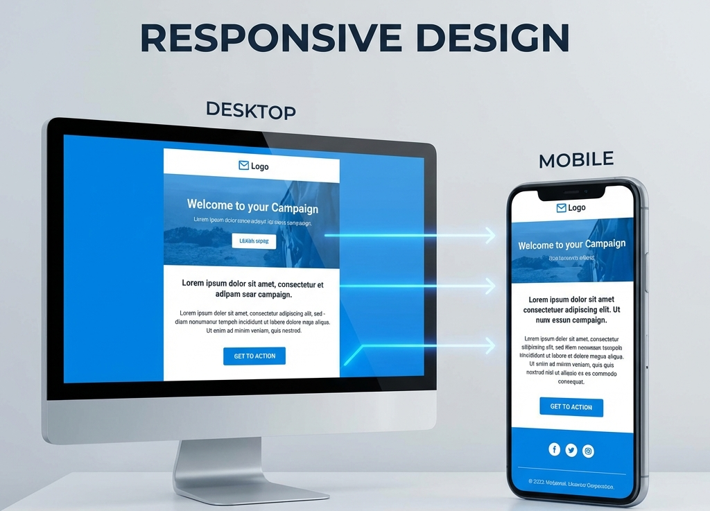
How to Structure an Email for Mobile and Desktop (Without Complex Code)
Simplicity is Your Best Friend
You don’t need to be an HTML expert or wrestle with nested tables to create an email that works well. The secret isn’t in complex code, but in smart structure.
Here are the fundamental principles to ensure your emails look great on both an iPhone 15 and Outlook for desktop.
1. The Golden Rule: Single Column
The most common mistake is trying to replicate a multi-column webpage layout (sidebar, main content, etc.). On mobile, this is a disaster.
The solution: Always design with a single column.
- Content flows naturally from top to bottom.
- It looks clean and centered on desktop.
- It fills the available width on mobile without breaking anything.
2. Visual Hierarchy (The Inverted Pyramid)
Guide the reader’s eye. Don’t make them think.
- Header/Logo: Immediate identity.
- Hero Image or Headline: Capture attention.
- Supporting Text: Concisely explain the value.
- Call to Action (CTA): The final button.
3. Thumb-friendly Buttons
On desktop, we use a precise 1px cursor. On mobile, we use our thumbs, which are imprecise.
- Ensure your buttons are at least 44px tall.
- Give them space. Don’t place an “unsubscribe” link right next to the “buy” button.
4. Readable Text
Forget about small fonts.
- Body text: Minimum 16px. Anything less forces zooming or strains the eyes.
- Headings: Minimum 22-24px for clear contrast.
- Alignment: Left-aligned text is easier to read than centered text, especially for longer paragraphs.
5. Responsive Images
Ensure your images always have a width of 100% of the container. On desktop, you can limit the maximum width of the email (standard is 600px) so lines of text don’t stretch forever, but the image must always adapt to the available width on small screens.
Conclusion
A responsive email doesn’t have to be technically difficult. If you stick to a single-column structure, large text, and clear buttons, you’ll solve 90% of compatibility issues without touching a single line of advanced CSS.